Colour Space
![]()
![]()
![]()
![]()
![]()
![]()
![]()
![]()
![]()
![]()
|
Colour Space
|
|
|
This is an area I just don't really understand and have not found any layman's explanation on the web. In the good old days, you chose your film and the processing lab did the rest for you. Different films gave different colours and/or saturation of a photo. But now you have to do all the work that was automatically done for you. You can therefore change 'films' by choosing different colour spaces on the screen, but whether you can then print them is another matter. The best advice I have found seems to say, just stick with sRGB as most cameras use that space as well as other devices, such as screens, printers and online print services. Therefore without any image open in Photoshop, set the spaces as shown below. You will find the settings in Photoshop Edit>Color Settings...
The Adobe RGB colour space can show more colours than sRGB, but I think you would be hard pressed to spot the difference in most photos. You can see how things change, by changing the Profile in View>Proof Setup>Custom... and selecting one of them. You can then toggle between the current space and a Proof space by using Control+Y. One of
the problems, I find, with understanding colour spaces, is that the colours have
to be held in the computer as numbers (usually RGB values), but just because
they have the same number does not mean that they represent the same colour!
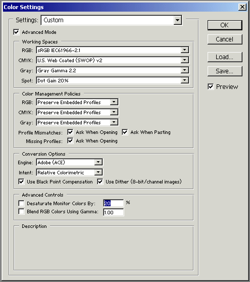
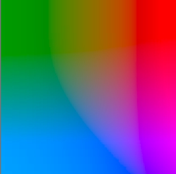
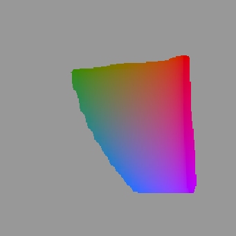
The following images show Adobe RGB (on the left) compared to sRGB (on the right)
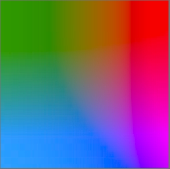
Now you now know as little as I do! In any image you open in Photoshop, you can see those out-of-gamut colours by selecting View>Gamut Warning. It is quite informative to have 2 windows open of the same image (Window>Documents>New Window) with the second one showing the Proof colour space and/or out-of-gamut - but only if you are preparing the image for printing (otherwise what you see you see!). In general, you want to use colour spaces that are as large as is practical. For example, if your printer (or lab) is capable of producing output in a colour space larger than sRGB, there is no reason to hobble your work by limiting output to the small sRGB gamut. If you do, you'll lose the saturated cyans and greens that can make your prints stand out.
|