
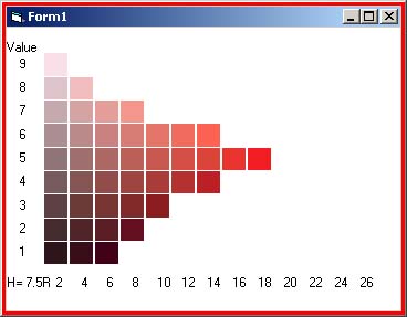
Munsell Colour System
Ever since I did perception experiments to see how one could differentiate colour Hues (using the HSB model) with my Colour Clock, I realised that we are not so good on the greens as the red/yellow (face) colours. Munsell defined a colour model using people rather than technology and the system is, I now believe, probably the best way to adjust images - but I've no idea how this could be implemented!
Actually Munsell was the first to separate hue, value, and chroma into perceptually uniform and independent dimensions back in the early 1900s. He produced a colour book which showed more colours than is possible on today's sRGB colour space, which has a limited colour gamut designed to match that of televisions and computer displays.
 |
Three-dimensional representation of original measurements |
I have got a bit distracted by this thought and attempted to find his model defined in the RGB colour space. Although there are a number of sites showing his hues and conversion calculators; the examples did not agree when I downloaded them and compared their values.
So I wrote a wee program to display them (using formulae from easyRGB and the Munsell and Yxy equivalent values), which I shall add to my Colour Watcher in due course, and the results agreed with both the Coloroid and the X-Rite Colour calculator for Munsell values.
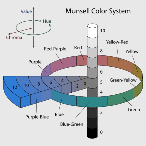
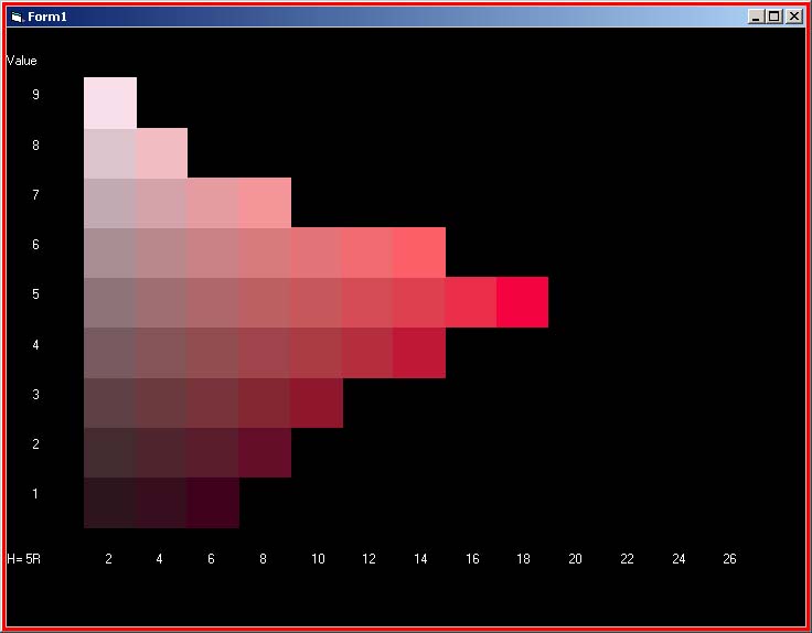
Here is my sRGB renditions of 7.5R.
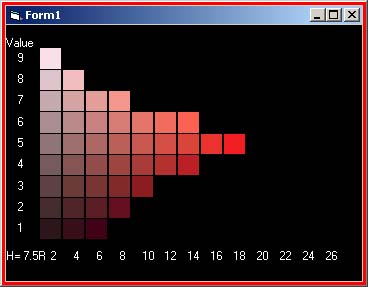 |
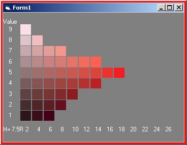 |
 |
| It is interesting that the background colour
changes our perception of the Hue (7.5R in this case).
It is also interesting to view the colours without gaps between them, which fool our eyes at the chroma boundary change. |
 |
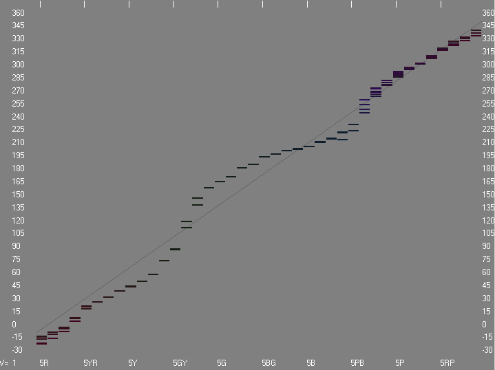
But how does this model compare to the HSB one?
| Here is a plot to compare the two and the 45 degree line to denote
agreement. Notice the really steep difference in the greens, which
signifies our inability to easily differentiate their hues.
The value changes from 1 through to 9 and back again, showing the Hue and Chroma. |
 |
|
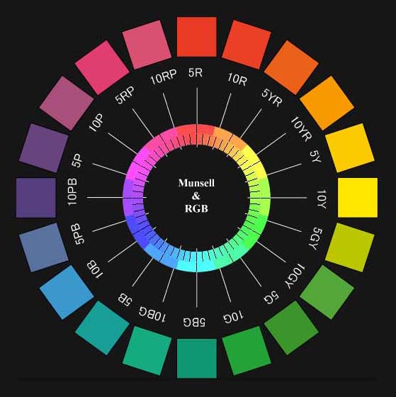
Notice that the curve changes with value (shown bottom left), especially at the lower end (as one would expect). If greens are difficult for us (my father says that painters find greens very hard) - why do camera sensors rely more on green than red or blue? - 'Tis a bit of a mystery. Finally this is how the two systems line up around the clock ! |
 |
But I realised that viewing the results though a web browser did not adjust for colour profiles - and worse (for me) is that my Colour Watcher reads screen values, not file or colour space ones.
So another diversion before getting back to the paintings...
![]()