


Colour Watcher - Screen and Profile colours
When I wrote my first Watcher (in 2007), I asked if it was possible to deduce the image values from the screen values and was told it was not achievable. However I thought I would experiment a bit and see what I could deduce.
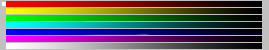
So I started with coloured gradients and got the Watcher to automatically read and record the (screen) values. [The white blob is to position the mouse before starting the 7 scans].
|
|
I could therefore plot the difference between the actual RGB values in the image and what was displayed to us on the screen - I'll call them the visual colours - because the Watcher reads screen values.
Just to state the obvious, a colour profile takes the channel values in the image and modifies them before displaying the colours on the screen. Profile aware programs, such as Photoshop, modify the image values (according to the embedded profile) and others, such as most browsers, do not (or assume a fixed profile). I think of it rather like a wysisug word processor, sometimes you see the raw text and at other times the formatted view. And just to make matters worse, with the exception of the Lab Colour space (and Munsell), all colour spaces are device dependent and not 'absolute'.
What I did not realise is that Photoshop does not always give you what you expect and it took me two painful weeks to get meaningful results and then only with the help of Mike Russell (of CurveMeister fame) - see here.
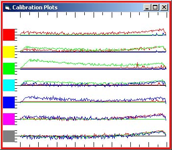
Let me show you what I discovered and perhaps it will blow your mind as it did mine. I will zig-zag the text across the page, showing the file values on the left and the visual (Photoshop) ones on the right.
|
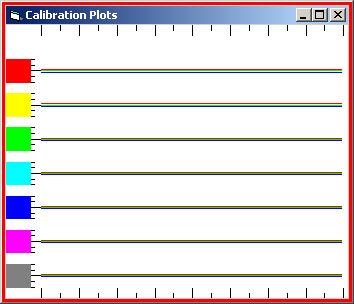
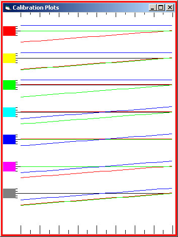
2/ But what if we view it in Photoshop? (on the right). |
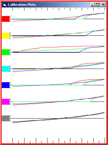
1/ Here (on the left) is the
plot showing the gradients, with 255 on the left and 0 on the
right. The red and blue lines are separated by a pixel from the
green (actual) line so we can see them. This is exactly what we
would expect.
|
|
4/ And to the right the Photoshop profiled rendition. |
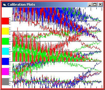
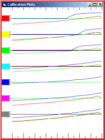
3/ But what about a jpg
version? Here (on the left) it is at maximum resolution (PS level
12) as viewed by Windows or in a browser - not quite as smooth.
|
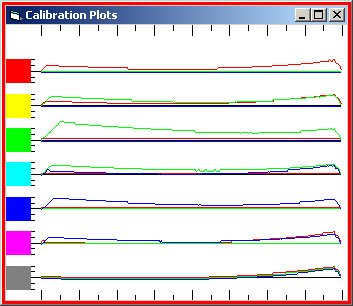
| 5/ I normally save
images for the web at medium resolution (PS level 5) - and wow this is
what happens.
I think level 8 (below) is perhaps a better compromise!
|
|
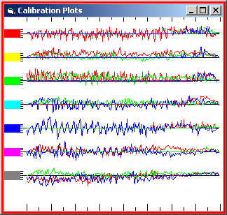
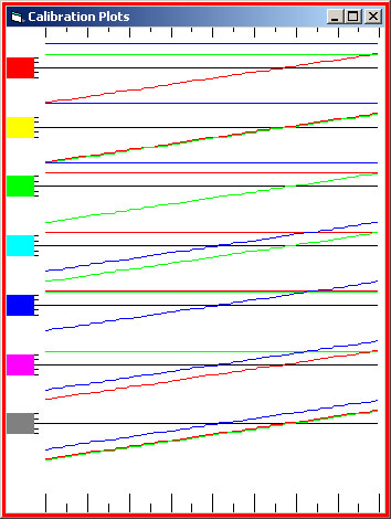
| 6/ What if we vary
the image a little by adding a coloured layer over the original image
layer? First I tried a grey (RGB 128,128,128) layer, normal blend mode, with Opacity set to 10% - so as not to blow the plot off the scale. Remember the plot is the difference from expected values 255 > 0. The little scales on the left of the plots show +10,+5,0,-5,-10 differences. I've also expanded the distance between the plots, so that the lines do not overlap.
|
|
|
8/ But in Photoshop (right plot), things are quite
different. Compare each plotted colour between these two renditions
and one will spot quite a few surprises! What is the red channel
doing in the green colour? And where did the green hump go to (see 1st
right plot at the top of the page)? |
7/ This (left) plot shows the
added channels and how they alter the original colours. So we have
green and blue at +13 added to the red gradient (1st plot line) and the
original red is now varying between -13 and +13 differences from what
the Watcher assumed the values to be.
|
| 9/ Will the same
thing happen with other colours? Tossed a coin and added a Blue layer - same as for the Grey one. RGB(0,0,128) normal blend mode, with Opacity set to 10%. |
|
|
11/ Same sort of result as for we had for the grey layer. A similar bump at the dark end, although now cutting in at 50. The red line is now 'behaving' itself in the green colour! |
10/ Exactly as one would
expect? Well, now just the Blue plot line shows up, but the red line has
taken a steeper hit from adding the blue. In fact all the colours,
even the neutral, have been effected more!
|
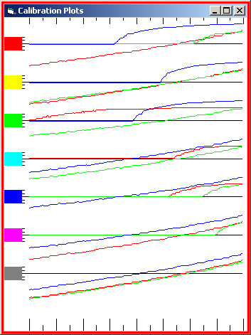
| 12/ Now what if both the grey and blue layers were visible? | |
|
14/ The Photoshop plot (right) is not as predictable, but follows the pattern of the individual layers. |
13/ No surprises (left) - all
the plots are what one would expect from the addition of these extra
layers. Sorry but is gets a little harder to see which channel
plots are for each colour - look both ends of the line to deduce who
belongs to whom.
But...
|
| 15/ Well if that was not surprising - hold on to your hats for a couple of more surprises on the next page! | |
![]()