Blogg
![]()
![]()
![]()
![]()
![]()
![]()
![]()
![]()
![]()
![]()
|
Blogg
|
|
|
14th March 2013
7th July 2011 Nothing to do with photography, but I just love this video
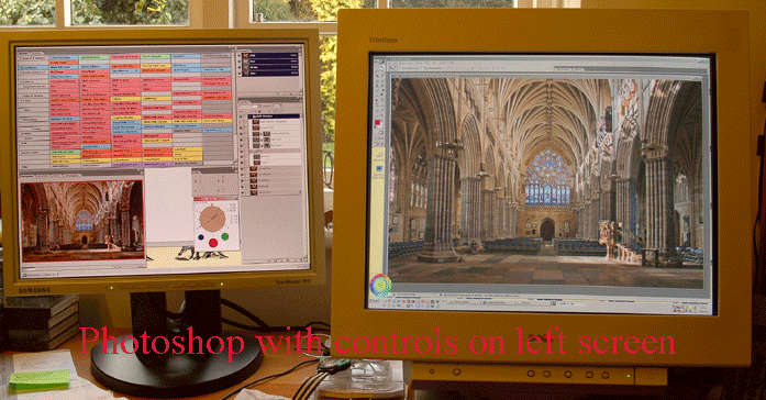
6th Jan 2011 Just been given an old LCD screen by my son.
Unfortunately my PC will not allow me to calibrate them individually - but
now I can really have a great layout for my post-processing with all my Actions,
Layers and palettes on the left (uncalibrated) screen and get a full 50% view of
the photo on my main (calibrated) screen. Plus, when I use CurveMeister I
can curve with great ease. A happy new year to me! 29th Sept 2010 We had another Exhibition and you can browse all the photos here, just as though you were there! 5th Jan 2010 Well I've just finished my experiment looking at screen and image channel values - been a bit of an eye opener. I need to sleep on it, but I think it means that one should forget about the Photoshop info palette (as it gives image RGB values, not those of the current colour space) and pay more attention to screen visual colour values. In a sense this too is a red herring as our colour system is extremely adaptive and also easily fooled by the surrounding colours and tones. 23rd Oct 2009 I recently met a Fellow from the Royal Photographic Society, that talked about the Licentiateship process and how more people failed submitting digital images compared to prints. He was a nice old bloke, but it soon became obvious that neither he or the RPS had really grasped much about the difference between the Digital world and the old film one. I found out that they do not use software that is properly calibrated to project the images and then fail people because of blown highlights etc. One would have thought that the society would have known about these problems. If you want to display images with a Viewer that is aware of both colour profiles embedded in photos and the monitor profile, then Windows Live Photo Gallery is the only one that will currently do it! Then there is the problem of sharpening. If I sharpen on a CRT screen, it will be too much on a LCD one and not nearly enough for a Print. But how do you sharpen for a projected image? I have found nothing on the web to help with this. How about blown highlights (even when the screen/projector is calibrated?) - if you can not see 252 on my home page, then you may say something is blown, when it might not be! - ditto tother end. So if the professionals can not understand this new world, how are we poor amateur meant to? The answer (?) is to acknowledge that the Digital medium is completely different from film and one should throw away the old ideas/standards and start afresh. Digital images impose a whole new set of constraints and technical bits to grasp, but it also allows one to take photos that are impossible on a physical medium - roll on PhArt I say. |