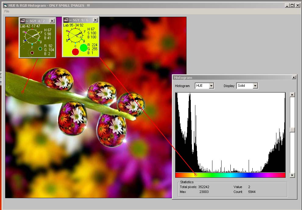
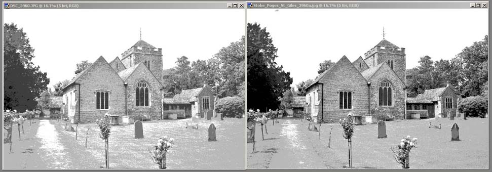
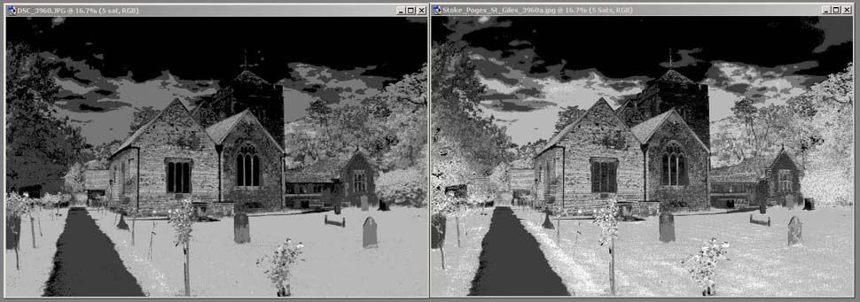
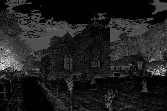
I then wondered, if the 5 stop tonal framework comparison (I did of the
landscapes) could be meaningfully expanded to colour. This turned out to
quite an interesting exercise using the HSB colour space.
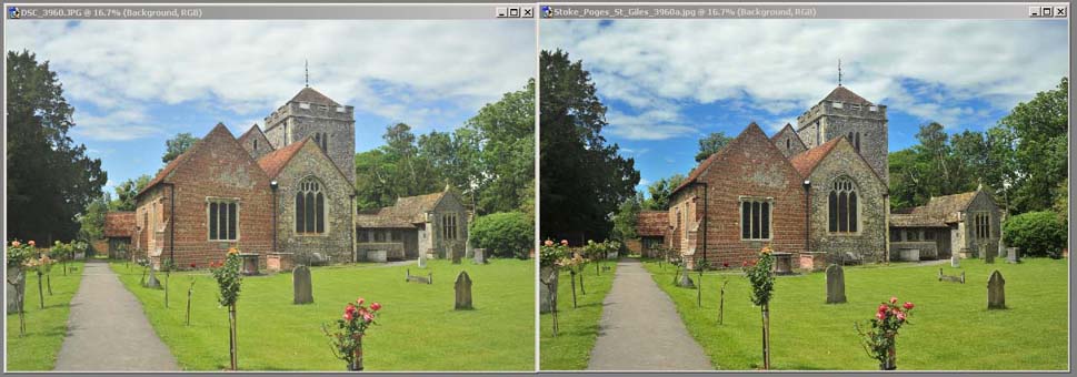
I chose a recent outdoor scene that I had
taken and enhanced to do the comparison. I did not do this while I was
processing, but it may have been a good idea.
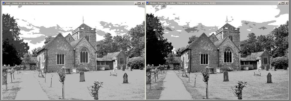
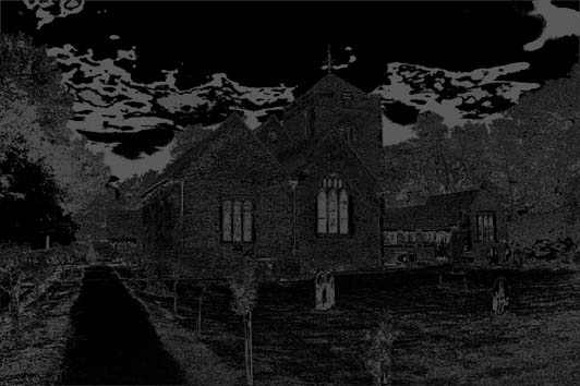
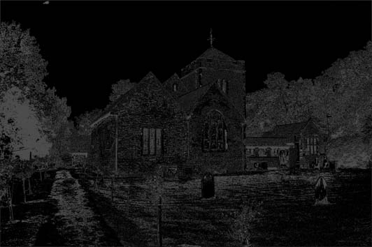
I have chosen to de-saturate the "5 Stop Tones" action (into grey bands,
rather than blue etc.) as the colouring may confuse the picture!
Remember that in the 5 band split, all detail is lost and we just have bands
of grey shading.
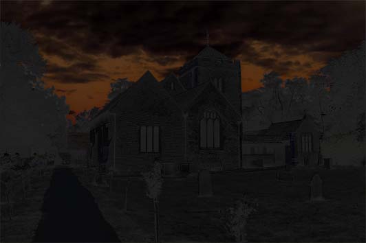
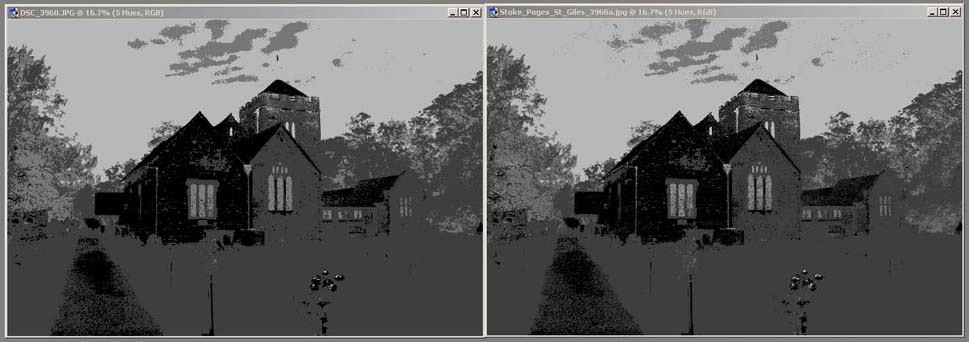
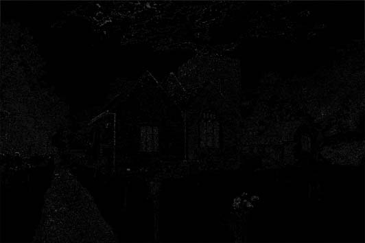
To the right of the pair of images below is the difference between them
(Black means no difference and White more difference - slightly exaggerated
by a Levels adjustment layer - same setting for all of them). Again
except for the first one, they are just 5 bands of grey.
[Just to recap - the "5 stop tones" action splits the image up into
shadows, 3/4 tones, mid tones, 1/4 tones and highlights and assigns a colour
to each band]