
Conclusion
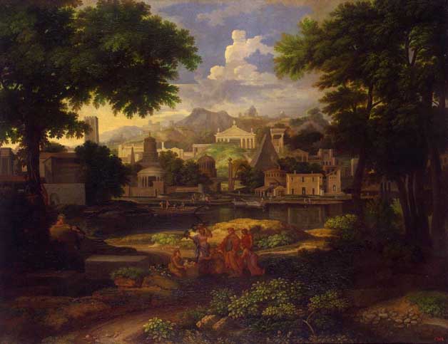
The painting
I am not so excited about this painting and apart from the blue sky, I prefer my corrected version (perhaps the painting is in need of a clean?).
Major findings
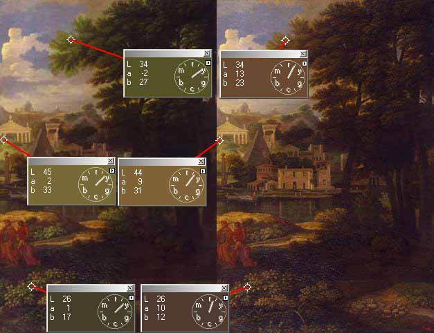
We can be fooled into accepting colours, even if they are blatantly wrong.
Colour is perception (i.e. what we expect an object to be)
and Colour is relative (to those around it)
| Leaves on the trees need not be green - this
is the 'green-ness' colour I could find!
|
|

This seems to imply that correcting photos by numbers is not necessary a good idea !
Interesting
points
Pastoral (?) scenes should have less variation in the colour saturation levels.
Perspective is completely (?) mad, but acceptable in a painting.
Again there is a very small area of highlight.Experiment
| What happens if we add green to the leaves?
Now the grass under the far white building looks much too green, but everything else looks fine to me! I do not thinks it changes the mood of the painting. Perhaps one should increase the brightness of the people to make them stand out more, but as the image does not really grab me, I shall not bother. |
 |
| Here is the green and original versions, showing what has changed. |
|
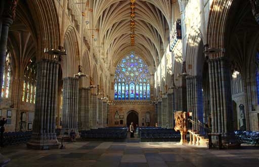
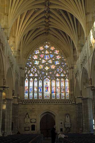
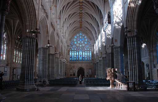
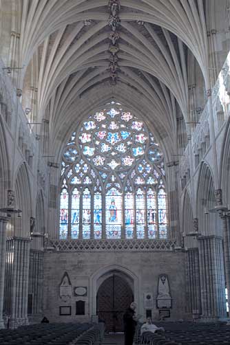
The colours in an image will change it's mood - so I thought it might be interesting to compare a couple of photos I took of Exeter Cathedral , that I had processed differently to convey different moods (that I thought matched the particular image).
|
|
and this a cool, empty feeling and probably more correct. |
|
| This was to give a warm feeling | ||
|
|
 |
|
|
and then I've switched them around - did I get it
right on my initial processing? |
||
My this project is fun - it keeps asking questions and provoking ideas.