
The Start
There are some great sites on the web that offer images of the old master’s works – I used the Web Gallery of Art, which allows one to explore by artist or location/gallery and download reasonable sized images. But what images to download? - Well, I went for those that I would be happy to hang on my walls, or those which showed interesting colours or tones.
I collected around 100 and then pruned them into two small sets, which you can see here.
Initial Impressions
Landscapes: Nearly all the selected images had very small areas of highlights and weak/non-saturated skies.
People : Nearly all skin tones were out of the 12-1 O’clock Hue range, of acceptable skin tones, and
biased towards yellow.
I also noticed some problems...
a) The colour in the images was not necessary correct
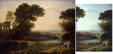
| I downloaded two images of CLAUDE LORRAIN's
"Landscape with the Rest on the Flight into Egypt" (from the
same gallery), one of which was a close-up of the right hand side.
Suddenly we have a blue sky! |
 |
b) The shadow tones were dominant in most of the images:
i) this was either wrong,
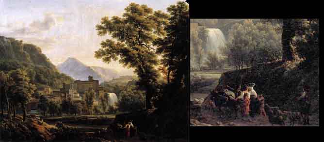
| Two images of DROLLING, Martin "Interior
of a Kitchen" (from the same gallery), with a close-up on the
right.
In the end I did not select this image in the evaluation. |
 |
ii) or painted detail had been lost over time.
 |
|
This is BIDAULD's " View of the Isle of Sora".
|
Off we go!
I think the best way forward is to analyse each image, in alphabetical order, starting with Landscapes (as I have not and probably never will take nudes!).
For each image, I shall then attempt to summarise my findings and to try to copy some of the techniques and compare the result to 'conventional' processing.
![]()