
Conclusion
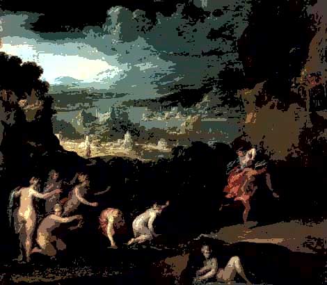
The painting
There does not seem to be a focal point and the eye just wander everywhere - I wonder why I chose it !
Major findings
The colours are acceptable.
With no concrete areas of equal toning, the eye is not directed to look at anything in particular.
Interesting points
Well none really, apart from the huge sky with no interesting clouds etc.
Where have I got to?
Well I feel I'm beginning to understand Tonal Frameworks, but I'm not making much headway on anything else, especially colour.
How about viewing colour with the 5 Stop tones or without tones at all?
|
|
|
|
|
|
|
|
|


Hm, we will have to see!
| But I've just read a bit about optical
illusions (here
- well worth the look), which tells me that using Hue clocks to
analyse colour may/will not work as our colour perception depends on its
surrounding.
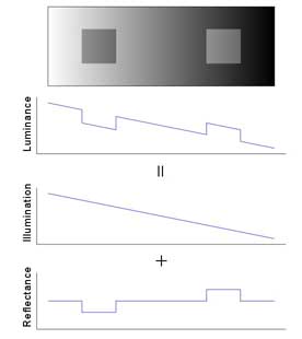
So all the advice on setting neutral points in an image and making sure that an object (greenery, sky etc.) is the correct Lab/RGB value, must be taken with a pinch of salt, IF one then thinks the colours look odd! I have seen this effect on the internal walls of churches, which sometimes look too green (I obviously have a problem with that tint!). In the opposite diagram the two squares have equal tone values, but we perceive them different. Therefore the tone framework on both large and small scale will greatly influence our perception of the image. By the way, it does not matter that the colour shown opposite is grey!
|
|
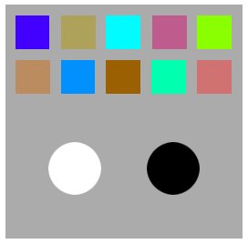
| And here one can see that cool colours can
easily appear "advancing" or "arousing" if they are
lighter and/or more intense than the warm colours around them; the white
disk appears "closer" than the black one.
|
|
How on earth can one measure/analyse these phenomena?
With all these implications, should I just give up now?!
![]()