


Channel Blending
This page describes some (so called) advanced post-processing techniques, which I have gathered from reading Dan's books and lurking on his forum etc. Actually they are very simple techniques once you get the general idea and can look at an image in a different way.
What I hope to demonstrate is that you can do some things by using the individual (rgb) Channels that you could not do in Curves etc. I am not attempting to produce a final image correction, just a step on the way to correcting an image - a step that would be very hard work to do any other way (I hope!).
So lets have a look at Channel blending (without having to learn how to use Photoshop channels!), but you should make the Channel Pallet visible (Window>Channels and park it with your Layers Palette).
I hope these descriptions will give you a taster for what is possible and maybe start you down the road of 'seeing' what is in an image, and therefore what can be easily done with it.
I should start of by saying that I am a beginner learner at seeing the colours channels - so I tend to run some of the 'seeing' actions (from my Actions page) and/or flick through the individual channels, as well as use the info palette (or my ColourWatcher!) in order to inspect an image.
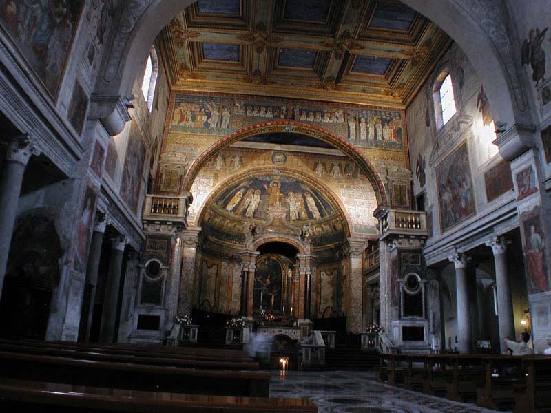
Let me start with this very simple example - it's really a cheating image, by that I mean I have chosen it to show a particular effect - but it should enable you to expand on the general idea and use it in other ways (with other blends and effects).
One way to view this technique is to imagine the individual channels as potential dodge and burn layers (painted in a Soft Light blend mode) - areas can be made lighter or darker depending on the grey levels within the layer - and then think Channel instead of Layer!
Anyway lets see how we get on - for starters, what I want to do with this image is make the (blue) walls lighter...
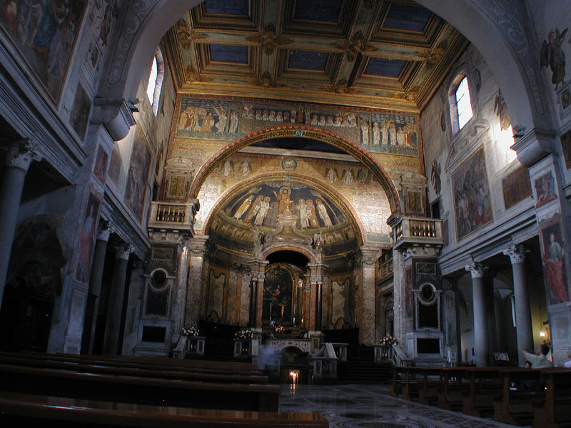 |
You can drag this image into Photoshop to play along and follow what I'm saying |
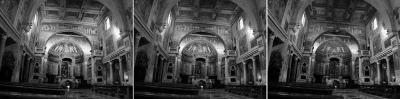
Now if we look at the individual rgb channels there are significant
differences that one can spot - compare the red (1st) and blue(3rd) ones - one
can see the differences, but it doesn't really stand out until you look quite
carefully.
Playing with Channels, is much the same as playing with Layers in as much as we can blend them or replace them with one another. I digress, but out of interest, you can sometimes quite effectively go along way to removing colour casts by replacing one channel with another. However what I wanted to do with this image was to lighten the (blue) walls and tone down the blown highlights on the altar wall.
If you move the mouse (in Photoshop) over the image and watch in the Info palette, you will notice that on the walls, in a lot of points, the Blue channel is lighter than the other two - for instance the first pillar on the right, nearest the altar, is rgb 89,101,123; and one can just see this in the channel image above.
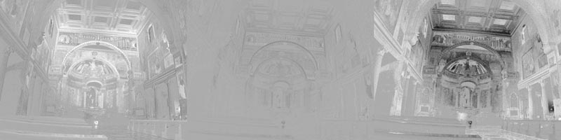
It becomes a lot more obvious when we compare the channels to mid-point grey
(128,128,128) - here they are (slightly exaggerated). Now it should be
more apparent that the walls in the blue channel are lighter than the other two
channels.
Now
if we take the Blue channel and apply it to the RGB channel in Lighten blend mode
on a new layer with it's blend mode set to
Luminosity - this will lighten
areas that are light in the Blue channels, but not others (ie the altar area).
Try this for yourself with this Action - note it will only work if you've installed my standard Actions. It makes using the Image>Apply Image... Photoshop feature very easy, as the result is added as a new Layer, so you can alter the Opacity or remove the effect if it is no good.
|
So here are the changes that have been made (using my SeeChanges Action, which compares before/after) - exaggerated a bit. Where the image is black, nothing changed and the lighter the colour the more the change. You should note that the Opacity of the new layer could be reduced if the effect was too much (but probably not in this case). All this without touching Levels or Curves! - in fact it could not be done using those tools - now we have a head start in the rest of your post-processing. |
 |
I should wind up by saying that normally the Green channel has more to offer if you are using Channels to adjust contrast (which is why I have included it in my standard Actions).
I hope this has given you food for thought and helped dispel
the myth that Apply Image is complicated - the hard part is channel
'seeing', the rest is moderately(?) obvious! - well it will be when you have
experimented/played a bit with this idea and learnt which blend mode to
use to create the effect you want. Lastly I should point out that not all
images have channel data that is distinct enough to be of use.
![]()
PS. I was asked the following questions and if you don't know the answer, then follow the links!
"Um, why could you NOT have done that with curves or levels? They're both really powerful tools." answer
"What if I wanted to darken the light blues?" answer
"What about doing the channel blending for 'real'?" answer